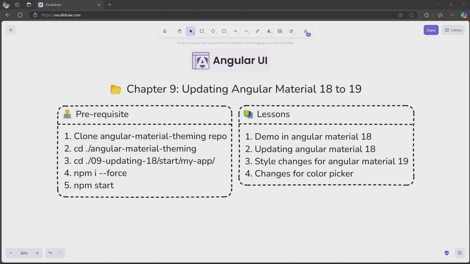

Demo in Angular Material 18
I am going to use the same demo as in the previous course, you can clone it from here.
Updating Angular Material 18 to 19
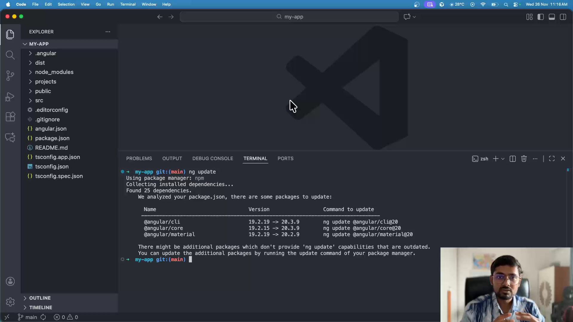
1. Checking for updates
ng update2. Update Angular CLI
ng update @angular/cli3. Update Angular Material
ng update @angular/materialStyle changes for Angular Material 19
1. Updates in main theme file
We will start with making changes in main theme file at src/styles.scss.
1.1 Remove redundant mixin usages
As we already have them outside, remove usage of mat.elevation-classes and mat.app-background mixins from withing :root selector.
@include mat.elevation-classes();@include mat.app-background();
:root { @include mat.elevation-classes(themes.$my-app-theme); @include mat.app-background(themes.$my-app-theme);}1.2 Remove individual component themes
:root { @include mat.button-theme(themes.$my-app-theme); @include mat.icon-theme(themes.$my-app-theme); @include mat.menu-theme(themes.$my-app-theme); @include mat.form-field-theme(themes.$my-app-theme); @include mat.input-theme(themes.$my-app-theme);}1.3 Changes for typography
Move typography mixin outside of :root and remove usage of themes.$my-app-theme in it.
@include mat.typography-hierarchy( mat.define-theme( ( typography: ( use-system-variables: true, system-variables-prefix: mat-sys, ), ) ));
:root { @include mat.typography-hierarchy(themes.$my-app-theme);}1.4 Use new theme mixin
:root { @include mat.theme( ( color: ( primary: mat.$azure-palette, tertiary: mat.$blue-palette, ), typography: Roboto, density: 0, ) );}We will modify the theme colors in next section.
1.5 Remove usage of system-level mixins
:root { @include mat.system-level-colors(themes.$my-app-theme); @include mat.system-level-typography(themes.$my-app-theme);}1.6 Changes in button-overrides
As some properties from v18 of button-overrides mixin are deprecated in v19, we need to use the new properties. Replace code of .overrides-example with the following:
// Customizing the button appearance using overrides API.overrides-example { button { @include mat.button-overrides( ( filled-container-color: #00ff00, protected-container-color: #00ff00, filled-container-height: 64px, outlined-container-height: 64px, protected-container-height: 64px, text-container-height: 64px, filled-container-shape: 32px, outlined-container-shape: 32px, protected-container-shape: 32px, text-container-shape: 32px, filled-label-text-color: orange, outlined-label-text-color: orange, protected-label-text-color: orange, text-label-text-color: orange, filled-ripple-color: #ff0000, protected-ripple-color: #ff0000, outlined-ripple-color: #ff0000, text-ripple-color: #ff0000, outlined-outline-color: #0000ff, ) ); }}2. Updates in dark theme
We will make similar changes in dark theme file at src/styles/themes/dark.scss.
2.1 Remove redundant mixin usages
.dark-theme { @include mat.elevation-classes(); @include mat.app-background();}2.2 Remove individual component colors
.dark-theme { @include mat.button-color(themes.$my-app-dark-theme); @include mat.icon-color(themes.$my-app-dark-theme); @include mat.menu-color(themes.$my-app-dark-theme); @include mat.form-field-color(themes.$my-app-dark-theme); @include mat.input-color(themes.$my-app-dark-theme);}2.3 Use color-scheme
.dark-theme { color-scheme: dark;}2.4 Remove usage of system-level mixins
.dark-theme { @include mat.system-level-colors(themes.$my-app-dark-theme); @include mat.system-level-typography(themes.$my-app-dark-theme);}3. Custom component style changes
3.1 Changes in component styles barrel file
Let’s clean up the barrel file at src/styles/components/_index.scss and keep only single line:
@forward "../../app/shared/components/alert/alert-theme.css";3.2 Remove usage of theme mixin
Remove usage of components.theme mixin from src/styles.scss and src/styles/themes/dark.scss files.
3.3 Using correct tokens
Simply find --sys and replace it with --mat-sys in whole project.
4. Changes for custom theme
We will make changes in src/styles/themes/_custom-theme.scss file.
4.1 Remove usage of define-theme function
$custom-theme: mat.define-theme( ( color: ( primary: mat.$rose-palette, tertiary: mat.$red-palette, use-system-variables: false, ), typography: ( plain-family: sans-serif, brand-family: monospace, use-system-variables: false, ), density: ( scale: -3, ), ));4.2 Remove component themes
.custom-theme { @include mat.button-color($custom-theme); @include mat.button-typography($custom-theme); @include mat.button-density($custom-theme);}4.3 Use new theme mixin
.custom-theme { @include mat.theme( ( color: ( primary: mat.$rose-palette, tertiary: mat.$red-palette, ), typography: ( plain-family: sans-serif, brand-family: monospace, ), density: -3, ) );}5. Remove usage of M3 theme file
We want to remove usage of m3-theme.scss file.
- Delete
m3-theme.scssfile. - Delete
src/styles/themes/_all.scssfile.
6. Create and use new palette file
6.1 Create new palette file
We will create new palette file at src/styles/themes/.
ng generate @angular/material:theme-color --primary-color 6750a4 --directory src/styles/themes/ --interactive false6.2 Use new palette file
We will use this palette in src/styles.scss file.
@use "./styles/themes/theme-colors";
:root { @include mat.theme( ( color: ( primary: mat.$azure-palette, primary: theme-colors.$primary-palette, tertiary: mat.$blue-palette, tertiary: theme-colors.$tertiary-palette, ), typography: Roboto, density: 0, ) );}6.2.1 Changes for button color variants
For button color variants, we need to remove usage of button-color mixin and use theme-overrides mixin instead. Note that buttons in Angular Material relies heavily on primary color, so we need to simply override it.
@each $variant in $color-variants { .mat-#{$variant} { @include mat.button-color(themes.$my-app-theme, $color-variant: $variant); @include mat.theme-overrides( ( primary: var(--mat-sys-#{$variant}), on-primary: var(--mat-sys-on-#{$variant}), ) ); }}Changes for color picker
If you change the color from color picker, you will see that the colors are not updated on the UI. This is because the color picker generates CSS variables with --sys prefix, but we are using --mat-sys prefix in our project.
We need to update the color picker to use --mat-sys prefix. Simply add below at the end of generateDynamicTheme function in src/app/shared/components/color-picker/color-picker.component.ts:
generateDynamicTheme(isDark?: boolean) { // rest remains same
const styles = targetElement.style; for (const key in styles) { if (Object.prototype.hasOwnProperty.call(styles, key)) { const propName = styles[key]; if (propName.indexOf('--md-sys') === 0) { const sysPropName = '--mat-sys' + propName.replace('--md-sys-color', ''); targetElement.style.setProperty( sysPropName, targetElement.style.getPropertyValue(propName) ); } } } }Changes for density
As of Angular Material 19.1, there is no API available from which we can get density. So, we need to manually pass the density value to alert component.
Let’s clean up src/app/shared/components/alert/_alert-theme.scss file, and keep only below content:
@use "sass:map";@use "@angular/material" as mat;
@mixin density($density) { $spacing: ( 0: 16px, -1: 12px, -2: 10px, -3: 8px, -4: 6px, -5: 4px, ); $scale-spacing: map.get($spacing, $density); .alert { padding: $scale-spacing; margin-bottom: $scale-spacing;
hr { margin: $scale-spacing 0; } }}Next, add forward this file from src/styles/components/_index.scss file.
@forward "../../app/shared/components/alert/alert-theme.css";@forward "../../app/shared/components/alert/alert-theme" as alert-theme-*;Lastly, go to main styles file at src/styles.scss and update the code include alert-theme-density mixin.
// rest remains same
:root { $density: 0; @include mat.theme( ( color: ( primary: theme-colors.$primary-palette, tertiary: theme-colors.$tertiary-palette, ), typography: Roboto, density: 0, density: $density, ) );
@include components.alert-theme-density($density);}Summary of changes for Angular Material Theming API
| # | Old API | New API |
|---|---|---|
| 1 | mat.define-theme function | mat.theme mixin |
| 2 | mat.get-theme-color function | --mat-sys-<color> system variable |
| 2.1 (Example) | color: mat.get-theme-color($theme, primary); | color: var(--mat-sys-primary); |
| 2.2 (Example) | color: mat.get-theme-color($theme, on-primary-container); | color: var(--mat-sys-on-primary-container); |
| 3 | mat.get-theme-typography function | --mat-sys-<level>-<size>-<token> system variable |
| 3.1 (Example) | font: mat.get-theme-typography($theme, "display-large"); | font: var(--mat-sys-display-large); |
| 3.2 (Example) | letter-spacing: mat.get-theme-typography($theme, "body-medium", "letter-spacing"); | letter-spacing: var(--mat-sys-body-medium-tracking); |
| 4 | mat.get-theme-density function | No equivalent new API, manually pass density |
| 5 | mat.typography-hierarchy mixin | Still available in new API, but not recommended to use. Instead, manually use typography system variables. |