
Pre-built theme
Angular Material includes several pre-built theme CSS files, each with different palettes selected. You can use one of these pre-built themes if you don’t want to define a custom theme with Sass.
How to use pre-built theme
There are 2 ways to use pre-built themes:
- Through schematic - when you run
ng add @angular/material, select the theme you want. - Through manually importing CSS file
When we installed Angular Material, we selected Custom in theme selection. If you want any pre-built theme, you can select any theme instead of Custom. There are 4 pre-built themes provided:
| Theme | Light or dark? | Primary Seed | Tertiary Seed |
|---|---|---|---|
| azure-blue.css | Light | #005cbb | #343dff |
| rose-red.css | Light | #ba005c | #c00100 |
| cyan-orange.css | Dark | #006a6a | #964900 |
| magenta-violet.css | Dark | #a900a9 | #7d00fa |
For instance, if you want to use azure-blue’s theme, you just need to include that file in the styles array of your project’s angular.json file:
"styles": [ "@angular/material/prebuilt-themes/azure-blue.css", // other styles],Custom theme
A theme file is a SASS file that uses Angular Material SASS mixins to produce color and typography CSS styles.
Let’s jump to src/styles.scss file and have a look at our theme:
@use "@angular/material" as mat;
html { @include mat.theme( ( color: ( theme-type: light, primary: mat.$azure-palette, tertiary: mat.$blue-palette, ), typography: Roboto, density: 0, ) );}
html,body { height: 100%;}body { margin: 0; font-family: Roboto, "Helvetica Neue", sans-serif;}Defining a theme
Angular Material represents a theme as a SASS map that contains your color, typography and density choices, as well as some base design system settings.
The mat.theme mixin
The mat.theme mixin takes a map that defines color, typography, and density values and outputs a set of CSS variables that control the component appearance and layout. These variables are based on Design Tokens.
The color variables are defined using the CSS color function light-dark so that your theme can switch between light and dark mode using the CSS property color-scheme.
The theme file in our application applies a azure and blue colors for primary and tertiary palettes, Roboto font, and standard density to the application’s Angular Material components. It targets the html selector to ensure the CSS variables are applied across the entire application.
The configuration object may have the following properties.
| Property | Description | Optional? |
|---|---|---|
color | A single color palette, or a color map | Yes, but required to declare CSS variables |
typography | A single font family value, or a typography map | Yes, but required to declare CSS variables |
density | Integers from 0 to -5 | Yes, defaults to 0 |
Each property is nothing but a dimension in Angular Material theming. For this chapter, we will focus on color property.
Color
The theme’s color determines the component color styles, such as the fill color of checkboxes or ripple color of buttons. It depends on color palettes of varying tones to build a color scheme. Check out the Palettes section to learn about available prebuilt palettes, or how to create custom palettes.
You can set the color in one of two ways: as a single color palette, or as a color map.
Single Color Palette
If you provide a single color palette, Angular Material uses its values for the theme’s primary, secondary, and tertiary colors. The CSS color values will be defined using light-dark CSS color function. Your application styles should define an explicit value declaration for the color-scheme CSS property.
A single color palette can be defined as below:
html { @include mat.theme( ( color: mat.$azure-palette, ) );}Color Map
If you provide a color map, then the tertiary color palette can be configured separately from the primary palette. The tertiary palette can be used to add a distinct accent color to some components.
You can also set the theme-type to determine the colors. theme-type can be one of the following:
color-scheme- include both light and dark colors using thelight-darkCSS color functionlight- only define the light color valuesdark- only define the dark color values
A color map can be defined as below:
html { @include mat.theme( ( color: ( theme-type: light, primary: mat.$azure-palette, tertiary: mat.$blue-palette, ) ) );}Color Palettes
A color palette is a set of similar colors with different hues ranging from light to dark. The Angular Material theme uses color palettes to create a color scheme to communicate an application’s hierarchy, state, and brand.
Let’s understand how a palette is structured, which are used for primary and tertiary properties as mentioned above.
Palette’s structure
A palette is a map of below properties:
| Property | Required | Description |
|---|---|---|
primary | Yes | Used for the most prominent components across the UI, such as the FAB, high-emphasis buttons, and active states |
secondary | Yes | Used for less prominent components in the UI such as filter chips |
tertiary | No | Used for contrasting accents that balance primary and secondary colors or bring heightened attention to an element such as an input field. |
neutral | Yes | Used for foreground elements, as these colors provided less emphasis |
neutral-variant | Yes | Used for medium emphasis and variants |
error | Yes | Used to communicate error states, such as an incorrect password entered into a text field |
To understand more about these properties take a look at Material 3 Color roles.
Palette HCT Tonal Values
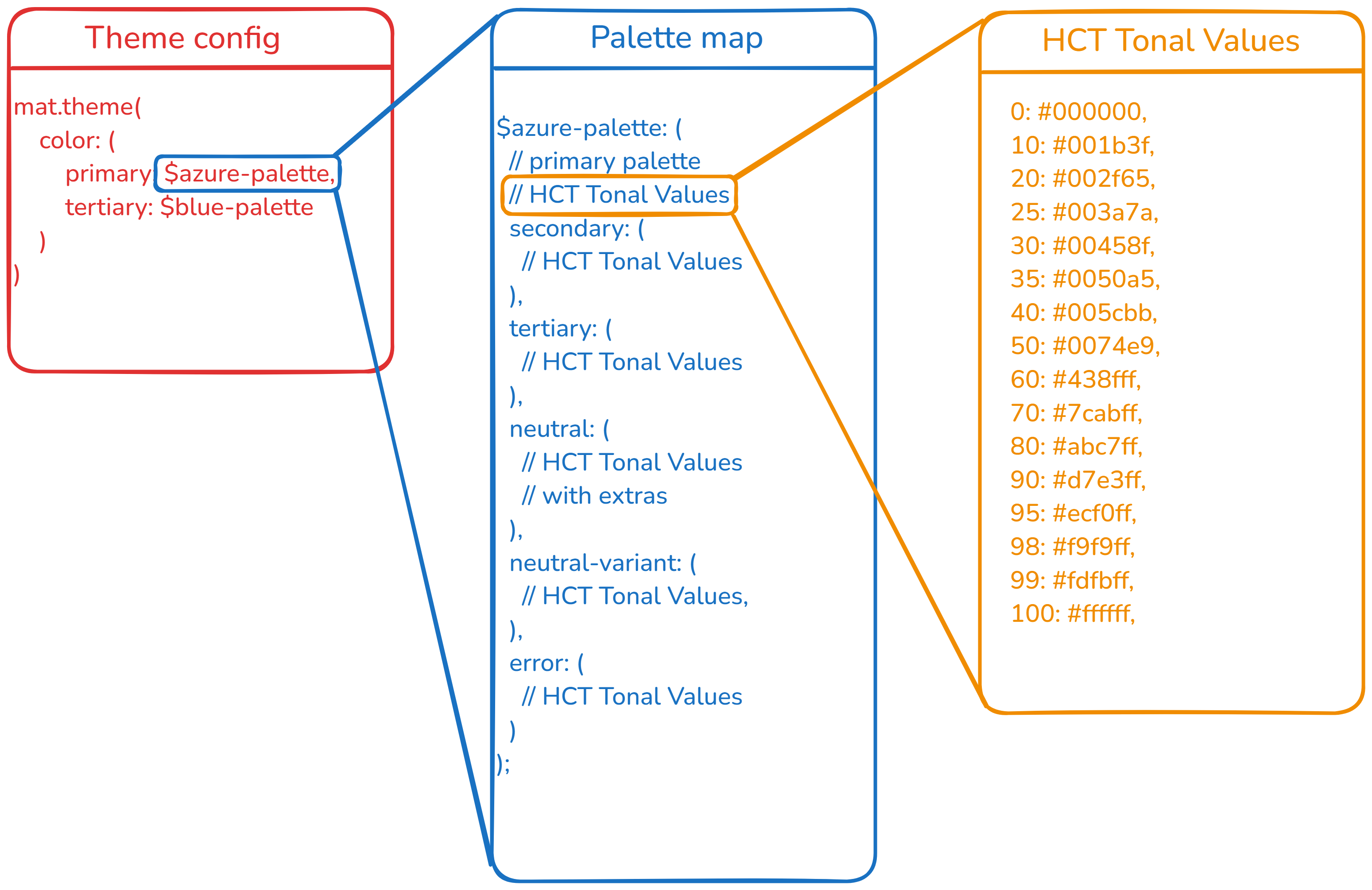
Each property of a palette is a map, which should have a valid CSS color associated with each of these keys, these are also referred as HCT Tonal Values: 0, 10, 20, 25, 30, 35, 40, 50, 60, 70, 80, 90, 95, 98, 99, 100 for all, plus 4, 6, 12, 17, 22, 24, 87, 92, 94, 96 extra colors for neutral.
For example, take a look at below map of $azure-palette:
$azure-palette: ( 0: #000000, 10: #001b3f, 20: #002f65, 25: #003a7a, 30: #00458f, 35: #0050a5, 40: #005cbb, 50: #0074e9, 60: #438fff, 70: #7cabff, 80: #abc7ff, 90: #d7e3ff, 95: #ecf0ff, 98: #f9f9ff, 99: #fdfbff, 100: #ffffff, secondary: ( // Colors map for the range 0, 10, 20, 25, 30, 35, 40, 50, 60, 70, 80, 90, 95, 98, 99, 100 ), tertiary: ( // Colors map for the range 0, 10, 20, 25, 30, 35, 40, 50, 60, 70, 80, 90, 95, 98, 99, 100 ), neutral: ( // Colors map for the range 0, 10, 20, 25, 30, 35, 40, 50, 60, 70, 80, 90, 95, 98, 99, 100 // plus additional colors for 4, 6, 12, 17, 22, 24, 87, 92, 94, 96 ), neutral-variant: ( // Colors map for the range 0, 10, 20, 25, 30, 35, 40, 50, 60, 70, 80, 90, 95, 98, 99, 100 ), error: ( // Colors map for the range 0, 10, 20, 25, 30, 35, 40, 50, 60, 70, 80, 90, 95, 98, 99, 100 ),);
Theme Color Property vs Palette Map Property
It can be confusing having primary and tertiary at two places: theme configuration and palette property.
primary/tertiaryin theme configuration refers to the color rolesprimary/tertiaryproperties in palettes help define the whole color role.
Theme Configuration for different inputs
Let’s understand how the final theme will look like for different inputs to mat.theme mixin.
For any input, the final theme is constructed like below:
| Color role | HCT Tonal Values |
|---|---|
primary | primary property from primary palette |
secondary | secondary property from primary palette |
tertiary | primary property from tertiary palette |
neutral | neutral property from primary palette |
neutral-variant | neutral-variant property from primary palette |
error | error property from primary palette |
Input 1: Not providing color property
When you don’t provide color property in theme configuration object, it will not generate CSS variables for color.
html { @include mat.theme();}Input 2: Not providing any palettes
When neither primary nor tertiary palettes are assigned in theme configuration object, it will take default values.
html { @include mat.theme( ( color: (), ) );}| Palette/Property | Default Value |
|---|---|
theme-type | color-scheme |
primary | $violet-palette |
tertiary | same as primary |
Final theme looks like below:
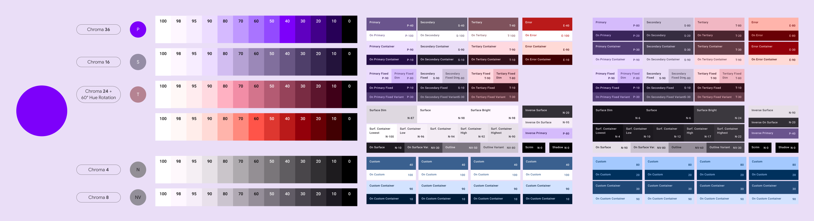
You can view the theme in action on Theme Builder for Angular Material.
Input 2: Providing only primary palette
When you provide only primary palette, Angular Material will use same for tertiary too:
html { @include mat.theme( ( color: ( primary: mat.$azure-palette, ), ) );}| Palette/Property | Provided Value | Interpreted Value |
|---|---|---|
theme-type | None | color-scheme |
primary | $azure-palette | $azure-palette |
tertiary | same as primary | $azure-palette |
Final theme looks like below:
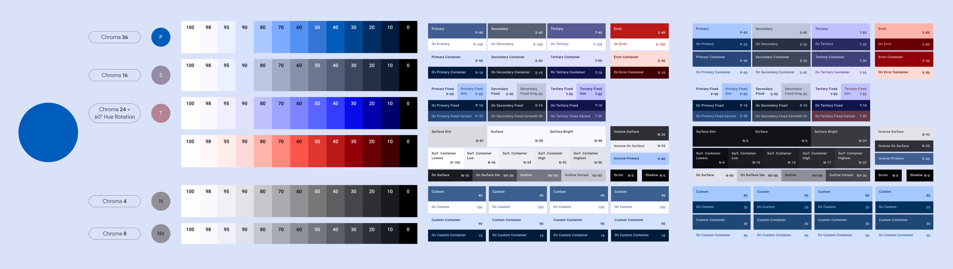
You can view the theme in action on Theme Builder for Angular Material.
Input 3: Providing both primary and tertiary palette
html { @include mat.theme( ( color: ( primary: mat.$azure-palette, tertiary: mat.$blue-palette, ), ) );}| Palette/Property | Provided Value | Interpreted Value |
|---|---|---|
theme-type | None | color-scheme |
primary | $azure-palette | $azure-palette |
tertiary | $blue-palette | $blue-palette |
Final theme looks like below:
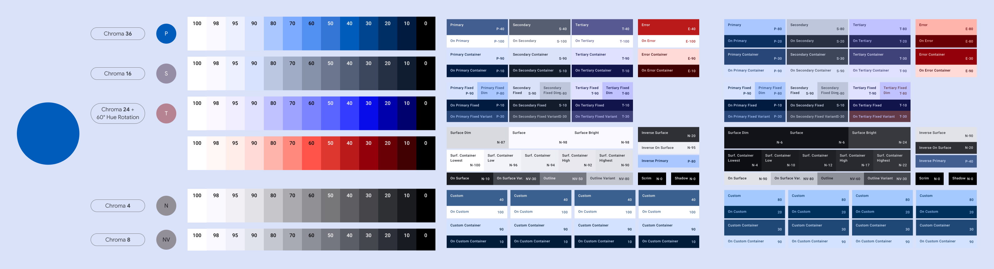
You can view the theme in action on Theme Builder for Angular Material.
Summary
To summarize, below is how whole theme is constructed:
- You pass theme palettes for
primaryandtertiary - A palette should contain these color roles:
primary,secondary,tertiary(optional),neutral,neutral-variant,error - Each color role should contain valid CSS color values for the range
0,10,20,25,30,35,40,50,60,70,80,90,95,98,99,100, plus4,6,12,17,22,24,87,92,94,96extra colors forneutral.
For example, one could create a custom palette for golden brown (#B17F32) color like below:
$golden-brown-palette: ( primary: ( 0: #000000, 10: #291800, 20: #452b00, 25: #533500, 30: #624000, 35: #724a00, 40: #815606, 50: #9d6e22, 60: #ba8739, 70: #d8a151, 80: #f6bc69, 90: #ffddb3, 95: #ffeedc, 98: #fff8f4, 99: #fffbff, 100: #ffffff, ), secondary: ( 0: #000000, 10: #291801, 20: #402d10, 25: #4c381a, 30: #584324, 35: #654e2f, 40: #725a3a, 50: #8d7350, 60: #a88c68, 70: #c4a680, 80: #e1c29a, 90: #feddb4, 95: #ffeedc, 98: #fff8f4, 99: #fffbff, 100: #ffffff, ), tertiary: ( 0: #000000, 10: #191e00, 20: #2c3400, 25: #364000, 30: #414c01, 35: #4c580e, 40: #58641a, 50: #717d31, 60: #8a9748, 70: #a5b260, 80: #c0ce78, 90: #dcea91, 95: #eaf99e, 98: #f6ffc0, 99: #fcffdd, 100: #ffffff, ), neutral: ( 0: #000000, 10: #201b15, 20: #352f29, 25: #403a34, 30: #4c463f, 35: #58514a, 40: #645d56, 50: #7e766e, 60: #988f87, 70: #b3aaa1, 80: #cfc5bb, 90: #ebe1d7, 95: #faefe5, 98: #fff8f4, 99: #fffbff, 100: #ffffff, 4: #120d08, 6: #17130d, 12: #241f19, 17: #2e2923, 22: #3a342d, 24: #3e3832, 87: #e3d8cf, 92: #f1e6dd, 94: #f7ece2, 96: #fdf2e8, ), neutral-variant: ( 0: #000000, 10: #221a0f, 20: #382f23, 25: #443a2d, 30: #504538, 35: #5c5143, 40: #685c4e, 50: #827566, 60: #9c8e7e, 70: #b8a998, 80: #d4c4b2, 90: #f1e0ce, 95: #ffeedc, 98: #fff8f4, 99: #fffbff, 100: #ffffff, ), error: ( 0: #000000, 10: #410002, 20: #690005, 25: #7e0007, 30: #93000a, 35: #a80710, 40: #ba1a1a, 50: #de3730, 60: #ff5449, 70: #ff897d, 80: #ffb4ab, 90: #ffdad6, 95: #ffedea, 98: #fff8f7, 99: #fffbff, 100: #ffffff, ),);Prebuilt Color Palettes
Angular Material provides twelve prebuilt color palettes that can be used for your application’s theme:
$red-palette$green-palette$blue-palette$yellow-palette$cyan-palette$magenta-palette$orange-palette$chartreuse-palette$spring-green-palette$azure-palette$violet-palette$rose-palette
In our application, $azure-palette is used for primary and $blue-palette for tertiary.
Custom Color Palettes
The Angular Material palette generation schematic builds custom color palettes based on a single color input for the primary color, and optionally color inputs to further customize secondary, tertiary, and neutral palettes.
Let’s run the schematic to generate a custom color palette:
ng generate @angular/material:theme-colorAfter running the above command answer the prompts as below:
| Prompt | Answer |
|---|---|
| What HEX color should be used to generate the M3 theme? | #6750a4 |
| What HEX color should be used represent the secondary color palette? | Leave blank |
| What HEX color should be used represent the tertiary color palette? | Leave blank |
| What HEX color should be used represent the neutral color palette? | Leave blank |
| Do you want to generate high contrast value override mixins for your themes? | Yes |
| What is the directory you want to place the generated theme file in? | src/styles/ |
Or you can run the schematic without answering any prompts by passing the color value as a parameter:
ng generate @angular/material:theme-color --primary-color 6750a4 --include-high-contrast --directory src/styles/ --interactive falseGenerated file output
The result of running the schematic is a new file with the generated custom colors. Color palettes get defined in the generated file that you can pass into the theme() mixin in your own theme file. See the Sass themes section for more information.
Sass themes
The output of the schematic will create a file named _theme-colors.scss at the src/styles directory. The exported palettes ($primary-palette and $tertiary-palette) can be provided to the theme mixin within your theme file to use the custom colors.
Let’s import the generated file and use the palettes in our src/styles.scss file:
@use "@angular/material" as mat;@use "./styles/theme-colors" as my-app-theme;
html { @include mat.theme( ( color: ( primary: mat.$azure-palette, primary: my-app-theme.$primary-palette, tertiary: mat.$blue-palette, tertiary: my-app-theme.$tertiary-palette, ), typography: Roboto, density: 0, ) );}// rest remains sameHigh contrast override mixins
High contrast override theme mixins are also generated in the file because we selected it in the prompts. These mixins override the system level variables with high contrast equivalent values from your theme. This is helpful for users who prefer more contrastful colors for either preference or accessibility reasons.
To show the high contrast values when user’s specify based on their color system preferences, apply the high-contrast-overrides() mixin from the generated file wrapped inside @media (prefers-contrast: more) in your theme file. You can pass in light, dark, or color-scheme. To see the high contrast values in your application locally, you can use Chrome DevTools to emulate the CSS media features.
html { // rest remains same
@media (prefers-contrast: more) { @include my-app-theme.high-contrast-overrides(light); }}Supporting Light and Dark Mode
By default, the mat.theme mixin defines colors using the CSS color function light-dark to make it easy for your application to switch between light and dark mode. The light-dark function depends on the value of color-scheme declared in your application’s global styles. If your application does not define a value for color-scheme, then the light colors will always be applied.
You can define color-scheme: light or color-scheme: dark to explicitly define your application’s mode. To set the mode depending on the user’s system
preferences, use color-scheme: light-dark. Let’s make that change in our src/styles.scss:
html { color-scheme: light dark;
@media (prefers-contrast: more) { @include my-app-theme.high-contrast-overrides(light); @include my-app-theme.high-contrast-overrides(color-scheme); }}Light and Dark themes based on user preferences
Instead of defining the mode in the theme file, you can define it based on user’s system preferences. We will use the strategy of defining color-scheme under a CSS selector so that the mode depends on whether that class has been applied. In our case, the application should display the light mode theme unless the class .dark-mode is added to the HTML body.
Let’s make that change in our src/styles.scss:
html { color-scheme: light dark; color-scheme: light; // rest remains same}
body.dark-mode { color-scheme: dark;}Default background and text colors
We will use the following styles in src/index.html to apply the theme’s surface background and on-surface text colors as a default across the application:
<!doctype html><html lang="en"> <head> <!-- rest remains same --> <style> .app-background { background: var(--mat-sys-surface); color: var(--mat-sys-on-surface); } </style> </head> <body class="mat-typography"> <body class="mat-typography app-background"> <app-root></app-root> </body></html>Theme toggle
To implement theme toggle, we will create a service and a component.
ThemeChangerService
To load the dark-theme based on user’s selection, we will simply implement a service called ThemeChangerService and whenever we want to change theme, we will call changeTheme from this service:
import { DOCUMENT } from '@angular/common';import { Injectable, inject, signal, effect } from '@angular/core';import { LocalStorageService } from './local-storage.service';
const LOCAL_STORAGE_THEME_KEY = 'my-app-theme';export type Theme = 'dark' | 'light' | 'auto';export type ThemeWithoutAuto = Exclude<Theme, 'auto'>;const DARK_MODE_CLASS = 'dark-mode';
@Injectable({ providedIn: 'root' })export class ThemeChangerService { private _document = inject(DOCUMENT); private browserStorage = inject(LocalStorageService); private _isDark = signal(false); public isDark = this._isDark.asReadonly(); private _window = this._document.defaultView;
constructor() { this.setTheme(this.getPreferredTheme()); if (this._window !== null && this._window.matchMedia) { this._window .matchMedia('(prefers-color-scheme: dark)') .addEventListener('change', () => { const storedTheme = this.getStoredTheme(); if (storedTheme !== 'light' && storedTheme !== 'dark') { this.setTheme(this.getPreferredTheme()); } }); }
effect(() => { if (this._isDark()) { this._document.documentElement.classList.add(DARK_MODE_CLASS); this.setStoredTheme('dark'); } else { this._document.documentElement.classList.remove(DARK_MODE_CLASS); this.setStoredTheme('light'); } }); }
private getStoredTheme = () => this.browserStorage.load<ThemeWithoutAuto>(LOCAL_STORAGE_THEME_KEY); private setStoredTheme = (theme: ThemeWithoutAuto) => { this.browserStorage.save(LOCAL_STORAGE_THEME_KEY, theme); };
private getPreferredTheme = (): Theme => { const storedTheme = this.getStoredTheme();
if (storedTheme) { return storedTheme; }
if (this._window !== null && this._window.matchMedia) { return this._window.matchMedia('(prefers-color-scheme: dark)').matches ? 'dark' : 'light'; } return 'light'; };
private setTheme = ( theme: Theme, document = this._document, isDarkSignal = this._isDark ) => { if (document.defaultView !== null && document.defaultView.matchMedia) { if ( theme === 'auto' && document.defaultView.matchMedia('(prefers-color-scheme: dark)').matches ) { isDarkSignal.set(true); } else { isDarkSignal.set(theme === 'dark'); } } };
public changeTheme(theme: ThemeWithoutAuto) { this.setStoredTheme(theme); this.setTheme(theme); }}Codes for both, ThemeManager and BrowserStorage are self-explanatory. Please modify it according to need of your application.
ThemeToggleComponent
Now, we will create a component called ThemeToggleComponent which will be used to toggle the theme:
<div class="track [class.is-dark-mode]="isDark()"> <div class="dark-mode switch" role="button" (click)="changeTheme('dark')"> <mat-icon>dark_mode</mat-icon> </div> <div class="light-mode switch" role="button" (click)="changeTheme('light')"> <mat-icon>light_mode</mat-icon> </div></div>import { Component, inject } from '@angular/core';import { ThemeChangerService, ThemeWithoutAuto,} from '../../services/theme-changer.service';import { MatIconModule } from '@angular/material/icon';
@Component({ selector: 'app-theme-toggle', standalone: true, templateUrl: './theme-toggle.component.html', styleUrls: ['./theme-toggle.component.scss'], imports: [MatIconModule],})export class ThemeToggleComponent { private themeChanger = inject(ThemeChangerService); isDark = this.themeChanger.isDark;
changeTheme(theme: ThemeWithoutAuto) { this.themeChanger.changeTheme(theme); }}:host { --size: 36px; width: var(--size); height: var(--size); .switch { width: var(--size); height: var(--size); }}
:host { height: var(--size); transition: background-color 0.3s cubic-bezier(0.2, 0, 0, 1); border: 2px solid transparent; border-radius: 32px; outline: 1px solid #dee2e6; cursor: pointer; user-select: none; overflow: hidden;}
.track { transition: transform 0.3s cubic-bezier(0.2, 0, 0, 1); &.is-dark-mode { transform: translateY(calc(-1 * var(--size))); }}
.switch { display: flex; align-items: center; justify-content: center;}Next, we will add this component to the AppComponent:
<mat-toolbar color="primary"> <span>Todo App</span> <app-theme-toggle class="theme-toggle"></app-theme-toggle></mat-toolbar>import { ThemeToggleComponent } from './components/theme-toggle/theme-toggle.component';
@Component({ // rest remains same imports: [ // other imports ThemeToggleComponent, ],})export class AppComponent { /* ... */ }// rest remains same.mat-toolbar { // rest remains same
.theme-toggle { margin-left: auto; }}