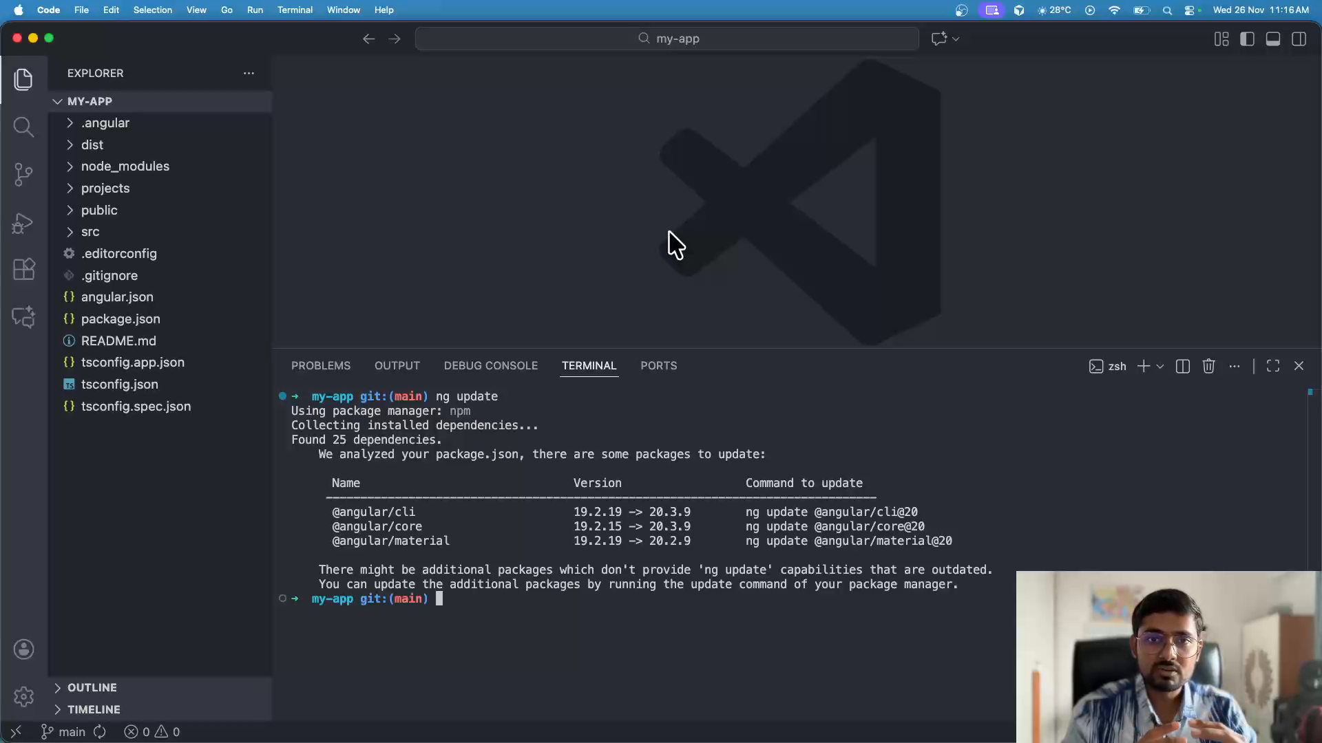
Starting with Angular Material 19

We are going to start with where we ended chapter 8: Adding more colors.

Updating Angular 19 to 20

1. Checking for updates

Terminal window
ng update

2. Update Angular CLI & Core

Terminal window
ng update @angular/cli

2.1 @angular/cli migrations

When asked about migrations from @angular/cli, select all and press ENTER.

Terminal window
[use-application-builder] Migrate application projects to the new build system. (https://angular.dev/tools/cli/build-system-migration)

2.2 @angular/core migrations

When asked about migrations from @angular/core, select all and press ENTER.

Terminal window
[control-flow-migration] Converts the entire application to block control flow syntax.
[router-current-navigation] Replaces usages of the deprecated Router.getCurrentNavigation method with the Router.currentNavigation signal.

What changed in Angular 20

Angular 20 brings several improvements and changes to the framework. The major updates include:

  1. Control Flow Migration: Angular 20 continues to promote the new block control flow syntax introduced in Angular 17, providing automated migration tools to convert your templates.
  2. Router Improvements: The Router.getCurrentNavigation() method has been deprecated in favor of the new Router.currentNavigation signal, aligning with Angular’s signal-based reactivity model.
  3. Build System Updates: The application builder continues to receive improvements and optimizations for better build performance.

1. Control Flow Migration

If you haven’t already migrated to the new control flow syntax, Angular 20 provides automated migration that converts:

  • *ngIf to @if
  • *ngFor to @for
  • *ngSwitch to @switch

Example of the new syntax:

<!-- Old syntax -->
<div *ngIf="isVisible">Content</div>
<!-- New syntax -->
@if (isVisible) {
<div>Content</div>
}

2. Router.currentNavigation Signal

The Router.getCurrentNavigation() method is now deprecated. Instead, use the signal-based Router.currentNavigation:

// New approach with signal
const navigation = this.router.currentNavigation;
const state = navigation()?.extras.state;
// Old approach (deprecated)
const navigation = this.router.getCurrentNavigation();
const state = navigation?.extras.state;

Updating Angular Material 20

After updating Angular CLI and Core, we need to update Angular Material to version 20.

Terminal window
ng update @angular/material

This command will:

  1. Update @angular/material package to version 20
  2. Update @angular/cdk (Component Dev Kit) to version 20
  3. Run migrations for below breaking changes:
    • Rename any CSS variables beginning with --mdc- to be --mat-
    • Rename Angular Material component token CSS variables that were renamed so that the base component’s name came first. For example, --mat-circular-progress will be renamed to --mat-progress-spinner. One more, from --mat-tonal-button- to --mat-button-tonal (component goes first, then variant). To view the full list, check out the schematic code on GitHub.

What changed in Angular Material 20

Angular Material 20 maintains compatibility with the theming system introduced in version 19. The major focus areas include:

1. Continued M3 Theme Support

Angular Material 20 continues to support the Material 3 (M3) design system with the same theming API introduced in version 19:

  • mat.theme() mixin for applying themes
  • mat.theme-overrides() for customizing specific tokens
  • System variables with --mat-sys-* prefix

2. Component Updates

All Angular Material components have been updated to work seamlessly with Angular 20’s improvements, including:

  • Enhanced signal compatibility
  • Better performance with the new control flow syntax
  • Improved accessibility features

3. No Breaking Theme Changes

Unlike the update from Angular Material 18 to 19, the update from 19 to 20 doesn’t require any major theming changes. Your existing theme configuration will continue to work without modifications.

Summary of Updates

The update from Angular 19 to 20 and Angular Material 19 to 20 is relatively straightforward compared to previous major version updates:

ComponentUpdate CommandMajor Changes
Angular CLI & Coreng update @angular/cliControl flow migration, Router signal API
Angular Materialng update @angular/materialComponent updates, no theme breaking changes

These were the changes related to our course, but Angular Material 20 has more changes and improvements, let’s see what more changed in Angular Material 20.

New Features

Tonal Button Support

Angular Material 20 introduces tonal buttons, a new Material Design 3 variant that provides a middle ground between filled and outlined buttons.

import { Component } from '@angular/core';
@Component({
selector: 'app-button-example',
template: `
<button matButton="tonal">Basic</button>
<button matButton="tonal" disabled>Disabled</button>
<a matButton="tonal" href="#">Link</a>
`
})
export class ButtonExampleComponent {}

The button appearance can now be set dynamically:

@Component({
selector: 'app-dynamic-button',
template: `
<button [matButton]="buttonAppearance()">Basic</button>
<button [matButton]="buttonAppearance()" disabled>Disabled</button>
<a [matButton]="buttonAppearance()" href="#">Link</a>
<br />
<mat-radio-group aria-label="Select an option" [(ngModel)]="buttonAppearance">
<mat-radio-button value="elevated">Elevated</mat-radio-button>
<mat-radio-button value="outlined">Outlined</mat-radio-button>
<mat-radio-button value="tonal">Tonal</mat-radio-button>
<mat-radio-button value="filled">Filled</mat-radio-button>
</mat-radio-group>
`,
imports: [MatButtonModule, FormsModule, MatRadioModule],
})
export class DynamicButtonComponent {
buttonAppearance = signal<'elevated' | 'outlined' | 'tonal' | 'filled'>(
'elevated'
);
}

Demo:

Filled Card Variant

Cards now support a filled variant that provides better visual hierarchy and surface distinction. You can use the appearance="filled" property to set the variant.

<mat-card class="example-card" appearance="filled">
<mat-card-header>
<div mat-card-avatar class="example-header-image"></div>
<mat-card-title>Shiba Inu</mat-card-title>
<mat-card-subtitle>Dog Breed</mat-card-subtitle>
</mat-card-header>
<img
mat-card-image
src="https://material.angular.dev/assets/img/examples/shiba2.jpg"
alt="Photo of a Shiba Inu"
/>
<mat-card-content>
<p>
The Shiba Inu is the smallest of the six original and distinct spitz
breeds of dog from Japan. A small, agile dog that copes very well with
mountainous terrain, the Shiba Inu was originally bred for hunting.
</p>
</mat-card-content>
<mat-card-actions>
<button matButton>LIKE</button>
<button matButton>SHARE</button>
</mat-card-actions>
</mat-card>

Demo:

Enhanced Dialog Control

The dialog component now includes a closePredicate option that provides fine-grained control over when dialogs can be closed.

export interface DialogData {
animal: string;
name: string;
}
@Component({
selector: 'dialog-overview-example',
templateUrl: 'dialog-overview-example.html',
imports: [MatFormFieldModule, MatInputModule, FormsModule, MatButtonModule],
changeDetection: ChangeDetectionStrategy.OnPush,
})
export class DialogOverviewExample {
readonly animal = signal('');
readonly name = model('');
readonly dialog = inject(MatDialog);
openDialog(): void {
const canClose = <Result = string>(result: Result | undefined): boolean => {
return typeof result === 'string' && result.toLowerCase() === 'dog';
};
const dialogRef = this.dialog.open<
DialogOverviewExampleDialog,
DialogData,
string | undefined
>(DialogOverviewExampleDialog, {
data: { name: this.name(), animal: this.animal() },
closePredicate: canClose,
});
dialogRef.afterClosed().subscribe((result) => {
if (result !== undefined) {
this.animal.set(result);
}
});
}
}
@Component({
selector: 'dialog-overview-example-dialog',
templateUrl: 'dialog-overview-example-dialog.html',
imports: [
MatFormFieldModule,
MatInputModule,
FormsModule,
MatButtonModule,
MatDialogTitle,
MatDialogContent,
MatDialogActions,
MatDialogClose,
],
})
export class DialogOverviewExampleDialog {
readonly dialogRef = inject(MatDialogRef<DialogOverviewExampleDialog>);
readonly data = inject<DialogData>(MAT_DIALOG_DATA);
readonly animal = model(this.data.animal);
}

Demo:

Drag and Drop Enhancements

The CDK drag-drop module introduces the resetToBoundary method for better boundary management. This is helpful if the boundary-element’s size is changed dynamically and you want to make sure that the dragged element stays within the boundary.

@Component({
selector: 'cdk-drag-drop-boundary-example',
templateUrl: 'cdk-drag-drop-boundary-example.html',
styleUrl: 'cdk-drag-drop-boundary-example.css',
imports: [CdkDrag, MatButtonModule],
})
export class CdkDragDropBoundaryExample {
@ViewChild('boundaryElement') boundaryElement: ElementRef<HTMLElement>;
@ViewChild('dragElement') dragElement: ElementRef<HTMLElement>;
@ViewChild(CdkDrag) dragInstance: CdkDrag;
setBoundary(height: string, width: string) {
this.boundaryElement.nativeElement.style.height = height;
this.boundaryElement.nativeElement.style.width = width;
}
resetToBoundary() {
this.dragInstance.resetToBoundary();
}
}

Demo:

Autocomplete Backdrop Support

Autocomplete now supports overlay backdrops for better focus management. You can provide a hasBackdrop property using MAT_AUTOCOMPLETE_DEFAULT_OPTIONS injection token.

@Component({
// rest
providers: [
{
provide: MAT_AUTOCOMPLETE_DEFAULT_OPTIONS,
useValue: { hasBackdrop: true },
},
],
})
export class AutocompleteAutoActiveFirstOptionExample implements OnInit {
// content reduced for brevity
}

Demo:

Other Changes

  • Angular Material now automatically respects the user’s motion preferences set at the system level through the prefers-reduced-motion media query.
  • Form fields now better preserve externally set aria-describedby attributes across all form controls.
  • Form fields now use optimized DOM access patterns and ResizeObserver for better performance.
  • The overlay system now provides tree-shakeable alternatives for better bundle optimization.
  • Chip inputs now properly handle placeholders and the disabledInteractive property.
  • The slider component now properly handles null values and improved token management.
  • Tabs now handle zero animation duration properly, preventing flickering issues.

Conclusion

Angular Material 20 represents a significant step forward in the library’s evolution, bringing Material Design 3 features, improved accessibility, better performance, and modernized APIs. The new tonal buttons, filled cards, enhanced dialogs, and performance optimizations make this a compelling upgrade for Angular applications.

The breaking changes, while requiring some migration effort, help streamline the API surface and remove deprecated patterns. The provided schematics and migration tools help automate much of the upgrade process.

For detailed migration instructions and breaking change information, consult the official Angular Material changelog.

Next arrow_forward Understanding Card Overrides We will learn how to identify right tokens to override for a component.