
New Card Appearance
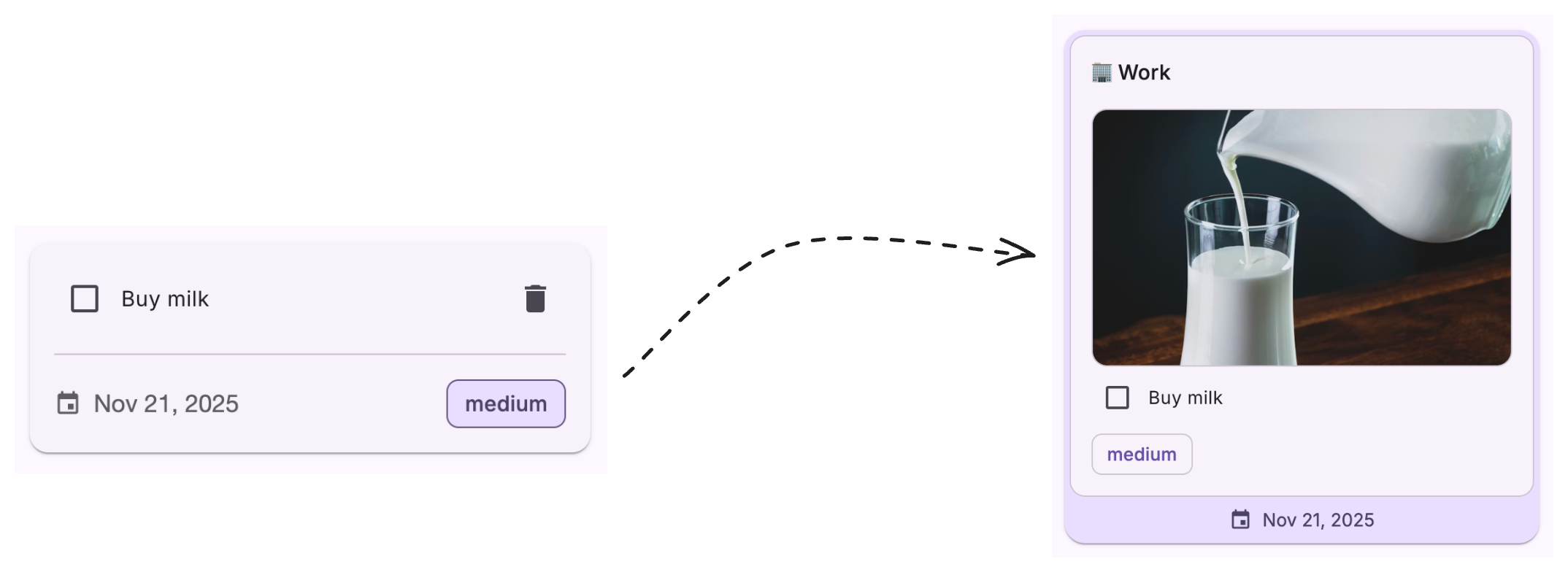
We want to modify the card appearance so something like below:
Add Category & Image URL in Todo
In this section, we will add two new fields to our todo items: a category and an image URL. This will help us demonstrate card customization in the next section.
1. Update Todo Interface
First, let’s add the new properties to our Todo interface at src/app/interfaces/todo.interface.ts:
export interface Todo { id: string; title: string; completed: boolean; dueDate: Date | null; priority: TodoPriority; createdAt: Date; updatedAt: Date; category: string; imageUrl: string;}2. Update Todo Form Interface
Update the todo form interface at src/app/interfaces/todo-form.interface.ts to include the new fields:
export interface TodoForm { title: FormControl<string>; dueDate: FormControl<Date | null>; priority: FormControl<TodoPriority>; category: FormControl<string>; imageUrl: FormControl<string>;}3. Add Category Options and Form Controls
Update the todo form dialog component at src/app/components/todo-form-dialog/todo-form-dialog.component.ts to add predefined categories and form controls for the new fields:
export class TodoFormDialogComponent { readonly categories = [ '🏢 Work', '👨💻 Personal', '🏠 Home', '🛒 Shopping', '🤷♂️ Other', ];
todoForm = new FormGroup<TodoForm>({ title: new FormControl('', { nonNullable: true, validators: [Validators.required], }), dueDate: new FormControl<Date | null>(null), priority: new FormControl(TodoPriority.Medium, { nonNullable: true }), category: new FormControl('', { nonNullable: true, validators: [Validators.required], }), imageUrl: new FormControl('', { nonNullable: true, validators: [Validators.required], }), });}4. Add Form Fields in Dialog Template
Update the dialog template at src/app/components/todo-form-dialog/todo-form-dialog.component.html to include a dropdown for category selection and an input for image URL:
<mat-form-field appearance="fill" class="full-width"> <mat-label>Category</mat-label> <mat-select formControlName="category"> @for (category of categories; track category) { <mat-option [value]="category">{{ category }}</mat-option> } </mat-select> @if (todoForm.get('category')?.hasError('required') && todoForm.get('category')?.touched) { <mat-error>Category is required</mat-error> }</mat-form-field>
<mat-form-field appearance="fill" class="full-width"> <mat-label>Image URL</mat-label> <input matInput formControlName="imageUrl" placeholder="Enter image URL" /> @if (todoForm.get('imageUrl')?.hasError('required') && todoForm.get('imageUrl')?.touched) { <mat-error>Image URL is required</mat-error> }</mat-form-field>5. Update TodoStorageService
Update the addTodo method signature in src/app/services/todo-storage.service.ts to accept the new parameters:
addTodo( title: string, dueDate: Date | null = null, priority: TodoPriority = TodoPriority.Medium, category: string, imageUrl: string): void { const newTodo: Todo = { id: crypto.randomUUID(), title, completed: false, dueDate, priority, createdAt: new Date(), updatedAt: new Date(), category, imageUrl, };
this.todosSignal.update((todos) => { return [newTodo, ...todos]; });}6. Update App Component
Finally, update the dialog result handling in src/app/app.component.ts to pass the new fields to the service:
dialogRef.afterClosed().subscribe((result) => { if (result) { this.todoService.addTodo( result.title, result.dueDate, result.priority, result.category, result.imageUrl );
this.snackBar.open('Todo added successfully', 'Close', { duration: 3000, }); }});Modify Card Appearance
Now that we have category and image data in our todos, let’s customize the card appearance. We’ll learn when to use Angular Material’s override mixins and when to apply custom CSS directly.
Understanding Component Token Overrides
Angular Material components expose certain design tokens that can be customized using component-specific override mixins (like mat.card-overrides). These tokens typically control:
- Container colors and shapes
- Text colors and typography
- State layer colors
- Elevation levels
However, not all styling can be controlled through these tokens. For custom layouts, spacing, and element-specific styles, we need to apply CSS directly.
1. Update Card Template Structure
Let’s completely restructure the card template at src/app/components/todo-list-section/todo-list-section.component.html to use Material Card’s header, content, and footer components:
<mat-card class="todo-card" [class]="'priority-' + todo.priority" [class.completed]="isCompleted" cdkDrag [cdkDragBoundary]="'.todo-list'" > <button mat-icon-button (click)="confirmDelete(todo)" class="delete-button"> <mat-icon>delete</mat-icon> </button> <mat-card-header class="todo-header"> <mat-card-subtitle> {{ todo.category }} </mat-card-subtitle> </mat-card-header> <mat-card-content class="todo-content"> <img mat-card-image [src]="todo.imageUrl" class="todo-image" /> <mat-checkbox [checked]="todo.completed" (change)="toggleTodo.emit(todo.id)" color="primary" > <span class="todo-title"> {{ todo.title }} </span> </mat-checkbox>
<div class="todo-priority-chip-container"> <mat-chip class="priority-chip"> {{ todo.priority }} </mat-chip> </div> </mat-card-content> <mat-card-footer class="todo-footer"> @if (todo.dueDate) { <span class="due-date"> <mat-icon>event</mat-icon> {{ todo.dueDate | date : "mediumDate" }} </span> } </mat-card-footer> </mat-card>2. Update Component Imports
Update the component imports in src/app/components/todo-list-section/todo-list-section.component.ts to include the new Material Card components:
import { MatCard, MatCardContent } from '@angular/material/card';import { MatCard, MatCardContent, MatCardImage, MatCardHeader, MatCardSubtitle, MatCardFooter,} from '@angular/material/card';import { MatCheckbox } from '@angular/material/checkbox';import { MatIcon } from '@angular/material/icon';import { MatButtonModule } from '@angular/material/button';import { MatChip } from '@angular/material/chips';import { MatDivider } from '@angular/material/divider';import { MatDialog } from '@angular/material/dialog';
@Component({ standalone: true, imports: [ MatCard, MatCardContent, MatCheckbox, MatIcon, MatButtonModule, MatChip, MatDivider, CdkDrag, CdkDropList, MatCardImage, MatCardHeader, MatCardSubtitle, MatCardFooter, ],})3. Using Card Override Mixin for Shape
Let’s use the mat.card-overrides mixin to customize the card’s border radius using Angular Material’s design tokens. Update src/app/components/todo-list-section/todo-list-section.component.scss:
.todo-card { margin: 0; cursor: move; position: relative; padding: 4px;
@include mat.card-overrides( ( elevated-container-shape: var(--mat-sys-corner-large), ) );}4. Priority-Based Card Background Colors
Now let’s use mat.card-overrides to apply different background colors based on priority. This demonstrates using override mixins within a loop:
@each $priority, $colors in $priority-colors { .priority-chip.priority-#{$priority} { background-color: map.get($colors, background); @include mat.chips-overrides( ( outline-color: map.get($colors, outline-color), label-text-color: map.get($colors, foreground), ) ); }
.todo-card.priority-#{$priority} { @include mat.card-overrides( ( elevated-container-color: map.get($colors, background), ) ); .due-date { color: map.get($colors, foreground); } }}This changes the approach from styling chips to styling the entire card based on priority, giving each card a colored background that matches its priority level.
5. Custom Styles for Layout and Positioning
For styles that aren’t exposed as design tokens, we need to apply CSS directly. Add these custom styles:
// Custom image styling - not available through tokens.todo-image { max-height: 200px; object-fit: cover; width: 100%; border-radius: var(--mat-sys-corner-medium); border: 1px solid var(--mat-sys-outline-variant);
.completed & { filter: grayscale(100%); }}
// Delete button with custom positioning.delete-button { position: absolute; top: -16px; right: -16px; background-color: var(--mat-sys-surface); box-shadow: 0 2px 4px 0 color-mix(in srgb, var(--mat-sys-shadow), transparent 80%); opacity: 0; transition: opacity 0.12s ease-in-out;
.cdk-drag-preview & { display: none; }
.todo-card:hover & { opacity: 1; }}
// Custom header styling.todo-header { padding-bottom: 16px !important; background-color: var(--mat-sys-surface-container-low); border-top-left-radius: var(--mat-sys-corner-medium); border-top-right-radius: var(--mat-sys-corner-medium); border-left: 1px solid var(--mat-sys-outline-variant); border-right: 1px solid var(--mat-sys-outline-variant); border-top: 1px solid var(--mat-sys-outline-variant);}
// Custom content styling.todo-content { background-color: var(--mat-sys-surface-container-low); border-bottom-left-radius: var(--mat-sys-corner-medium); border-bottom-right-radius: var(--mat-sys-corner-medium); border-bottom: 1px solid var(--mat-sys-outline-variant); border-left: 1px solid var(--mat-sys-outline-variant); border-right: 1px solid var(--mat-sys-outline-variant);}
// Custom footer styling.todo-footer { display: flex; justify-content: center; align-items: center; padding-top: 8px; padding-bottom: 4px;}
// Priority chip styling using override mixin.priority-chip { @include mat.chips-overrides( ( label-text-color: var(--mat-sys-primary), outline-color: var(--mat-sys-outline-variant), ) );}
// Due date styling.due-date { display: flex; align-items: center; gap: 0.5rem; font: var(--mat-sys-body-medium); line-height: var(--mat-sys-body-medium-line-height);
mat-icon { font-size: 18px; width: 18px; height: 18px; }}New Tab Active Indicator Appearance
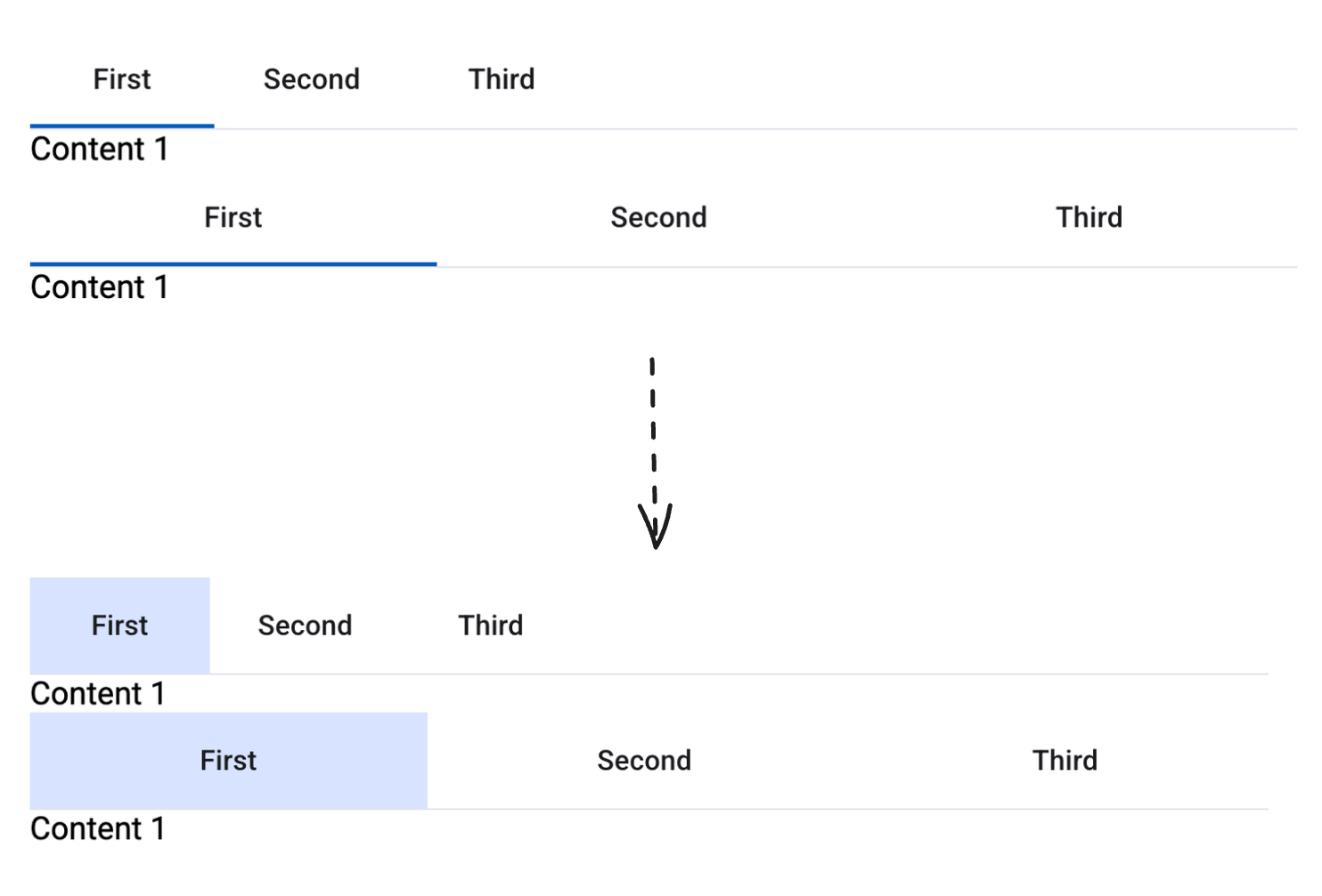
We want to modify the mat tab active indicator appearance so something like below:
Modify Mat Tab Active Indicator Appearance
To achive the desired appearance, we will use below styles in the template:
<mat-tab-group mat-stretch-tabs="false" mat-align-tabs="start" class="custom-indicator-tab-group"> <mat-tab label="First">Content 1</mat-tab> <mat-tab label="Second">Content 2</mat-tab> <mat-tab label="Third">Content 3</mat-tab></mat-tab-group><mat-tab-group class="custom-indicator-tab-group"> <mat-tab label="First">Content 1</mat-tab> <mat-tab label="Second">Content 2</mat-tab> <mat-tab label="Third">Content 3</mat-tab></mat-tab-group>@use '@angular/material' as mat;
// apply below class to <mat-tab-group />.custom-indicator-tab-group { --active-indicator-color: var(--mat-sys-primary-container); --active-indicator-height: 48px;
// set this to transparent if you don't want ripple to be visible --ripple-color: var(--mat-sys-on-surface);
@include mat.tabs-overrides( ( active-indicator-height: var(--active-indicator-height), active-indicator-color: var(--active-indicator-color), active-focus-indicator-color: var(--active-indicator-color), active-hover-indicator-color: var(--active-indicator-color), active-ripple-color: var(--ripple-color), inactive-ripple-color: var(--ripple-color), ) );}When to use override mixins vs. direct CSS:
Use override mixins (mat.card-overrides, mat.chips-overrides, etc.) when:
- The property is a design token (colors, shapes, typography levels)
- The property is documented in the component’s Styling documentation
- You want to ensure compatibility with future Angular Material updates
- Example:
elevated-container-color,elevated-container-shape,label-text-color
Use direct CSS when:
- Styling layout-specific properties (padding, margin, gap, positioning)
- Customizing child element styles (like images within cards)
- Adding hover states and transitions
- Applying filters or transforms
- The property is not exposed as a token
- Example:
position: absolute,border-radius,filter: grayscale(),opacity
Summary
In this chapter, we learned how to identify and use the right approach for customizing Angular Material components:
| Customization Type | Method | Use Case | Example |
|---|---|---|---|
| Design Tokens | Override mixins (mat.card-overrides) | Colors, shapes, typography levels | elevated-container-color, elevated-container-shape |
| Custom Classes | Direct CSS | Application-specific styles | .due-date { ... } |
Key Takeaway: Angular Material’s override mixins are powerful for theme-level customizations, but don’t hesitate to use standard CSS for layout and element-specific styling. The override mixins validate token names and provide better maintainability for theme-related properties, while direct CSS gives you flexibility for everything else.